How do I code a responsive HTML email with tables?
The hybrid fluid pattern: 100% outer wrapper, 600px inner container, and a media query that stacks columns on small screens.
Key takeaways
- ✓ Responsive email code tables use a hybrid pattern, not flex or grid.
-
✓
Desktop: two
<td>columns side by side inside a 600px container. -
✓
Mobile:
@media (max-width: 600px)setsdisplay:block; width:100%on each column. - ✓ Outlook desktop ignores media queries, so the desktop row must work without stacking.
Responsive email layout does not mean copying a Bootstrap grid into an inbox. Clients strip
flexbox, ignore external CSS, and render tables differently. The proven approach for responsive email
code tables is the hybrid (fluid) pattern: a full-width outer table, a fixed 600px inner container,
and column cells that stack when a <style> media query fires on narrow viewports.
Why use tables for responsive email layout?
Tables are the only layout primitive with consistent support across Gmail, Outlook, Apple Mail, and Yahoo. Div-based columns collapse or float unpredictably in Outlook's Word engine.
- Gmail: Supports media queries in many accounts; strips some class-based rules.
- Outlook desktop: Ignores media queries. Desktop layout must stand on its own.
- Apple Mail: Full media query support on iOS and macOS.
- Yahoo: Applies media queries in web and mobile apps.
For div pitfalls, read HTML email div layout. For table attribute basics, see table attributes.
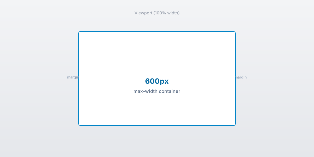
100% outer wrapper with a 600px inner container for responsive email layout.
What is the hybrid fluid pattern?
The hybrid pattern combines fixed and fluid widths so the email scales on phones without breaking on desktop Outlook.
- Outer table:
width="100%"fills the viewport or preview pane. - Inner container:
width="600"withstyle="max-width:600px;"caps content width. Details in container width. - Column cells: Two
<td>elements withalign="left"and explicitwidthattributes (e.g. 300px each). - Media query: At
max-width: 600px, cells becomedisplay:block; width:100%;so they stack.
How do I stack columns on mobile?
Put a <style> block in the <head> (Gmail and Apple Mail read it). Target
column class names and flip them to block-level at narrow widths. This is simple email responsive
code that works without flexbox.
<style type="text/css">
  @media only screen and (max-width: 600px) {
    .stack-column {
      display: block !important;
      width: 100% !important;
      max-width: 100% !important;
    }
  }
</style>- Add the
<style>block to the document<head>. - Assign
class="stack-column"to each column<td>. - Above 600px: cells sit side by side. Below 600px: they stack vertically.
What does Outlook ignore in responsive code?
Outlook desktop (Windows) uses Microsoft Word to render HTML. It does not apply @media rules, so
your two-column row stays side by side on a 320px Outlook window unless you build a separate mobile version
(rare).
- Design desktop columns that remain readable at ~300px each.
- Avoid tiny fonts that become illegible when columns do not stack.
- Use phantom tables when
max-widthbreaks in Outlook. See Outlook phantom table.
What is a responsive email code example?
Copy this skeleton as a starting point for responsive email code tables. It uses
border="0" cellpadding="0" cellspacing="0" and role="presentation" on layout tables.
<table border="0" cellpadding="0" cellspacing="0" width="100%" role="presentation">
  <tr>
    <td align="center">
      <table border="0" cellpadding="0" cellspacing="0" width="600" role="presentation"
        style="width:100%; max-width:600px;">
        <tr>
          <td class="stack-column" align="left" width="300" style="vertical-align:top;">
            Left column content
          </td>
          <td class="stack-column" align="left" width="300" style="vertical-align:top;">
            Right column content
          </td>
        </tr>
      </table>
    </td>
  </tr>
</table>
Pair the skeleton above with the media query from the previous section. No flex, no grid, no external stylesheet.
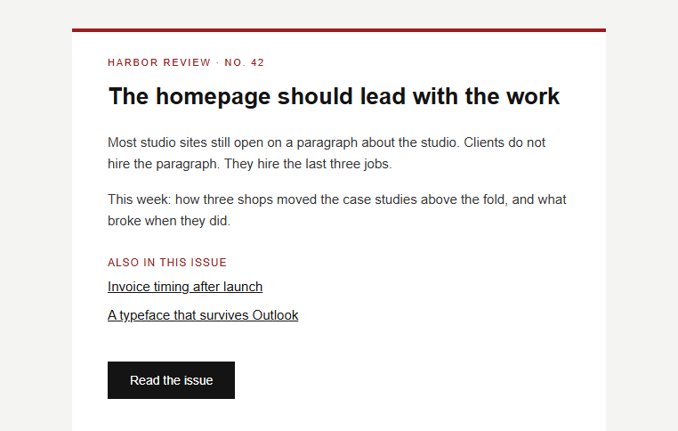
Newsletter template using table rows for each content section.
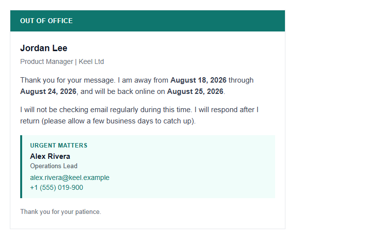
Single-column templates are the simplest responsive email layout.
How wide should the container be?
A 600px inner container is the standard for responsive email layout. It matches desktop preview panes and leaves room for padding on mobile screens.
- Set
width="600"on the inner table andwidth="100%"on the outer wrapper. - Add
style="max-width:600px;"so the container shrinks on narrow viewports. - Keep total HTML under ~102 KB to avoid Gmail clipping per Google's size limits (attachments allow up to 25 MB, but the body has a separate limit).
What about phantom tables in Outlook?
When max-width or fluid hybrids fail in Outlook desktop, wrap the inner container in a phantom
(ghost) table.
- Outlook reads the fixed-width phantom table.
- Other clients use the fluid wrapper with
max-width. - Full VML fallbacks live in Outlook phantom table.
For the full picture of table-based email structure, start with what is an HTML email template.
Summary
Simple email responsive code means hybrid tables: fluid outer wrapper, 600px inner container,
two <td> columns on desktop, and a max-width: 600px media query that stacks
them on mobile. Build the desktop row so it still works when Outlook ignores the query, and reach for phantom
tables only when fluid width breaks in Word-based Outlook.
Frequently asked questions
Related resources
Optimize your emails today
Send validation-checked HTML emails directly from your browser.
 Gmail/Yahoo - Free
Free plan available · See pricing